
MARIKO ANDO, Clown and Flower
Recommended by Nikki (Fine Print Photographer / Marketing and Digital Content Specialist
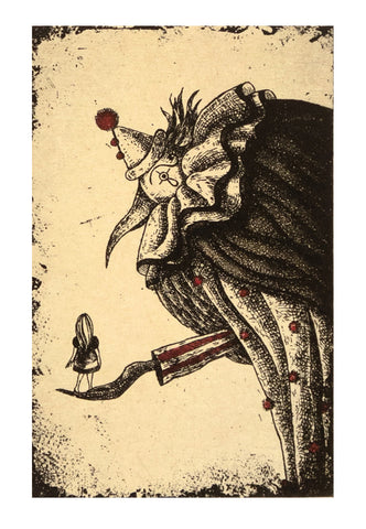
Ando intends viewers to feel something when they see a tiny human, or ‘flower’ (according to the title of the work) in the palm of a larger-than-life clown’s hand. With their back turned to viewers, the facial expression and emotions of the person with long hair and a dress are obscured from the viewer. Instead, the viewer must look to the other character for clues as to how they are supposed to feel about what is happening. It soon becomes apparent the clown’s expression is also obscured, but behind makeup and an exaggerated nose. This forces the viewer’s gaze back upon themselves, bringing them into the etching as a third character who gets to project their own thoughts and feelings onto the scene, freely.
ROBERT CONNELL, Sign and Pink Building
Recommended by Paige (Collections Manager / Marketing Coordinator):
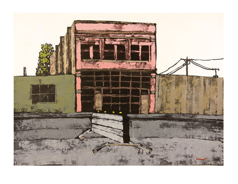
I am so captivated by Rob Connell's less-is-more, no-nonsense, it-is-what-it-is ink and gouache paintings. There is plenty of texture where there should be, plenty of contrast throughout, and nothing else to get in the way. His skies are often stark white, untouched and overexposed, while his windows are pitch black, completely concealing any interior. This piece has all of Connell's best features topped off with a uniquely pink building, speaking for the under-appreciated textures of our cities.
ROBERT PATIERNO, November Fishing
Recommended by Catherine (Collections Specialist):
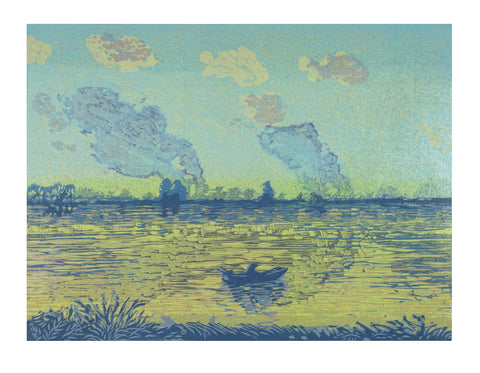
Robert Patierno's woodcuts are expressive depictions of nature, often vibrantly colored and highly abstract. 'November Fishing' uses a comparatively more calming color palette with gentle movement and delicate textures akin to impressionist paintings. Looking at this soothing piece instantly transports me to that small fishing boat in the middle of the shimmering, placid lake. I also find it interesting that Robert chose shades of blue and bright green to depict this November scene, as cooler tones aren't typically associated with late autumn. This may serve as a reminder that there is brightness and serenity to be found no matter where you are and no matter the season.
PETER MILTON, Sanctuary’s Edge
Recommended by Rebecca (Operations Gallery Manager):
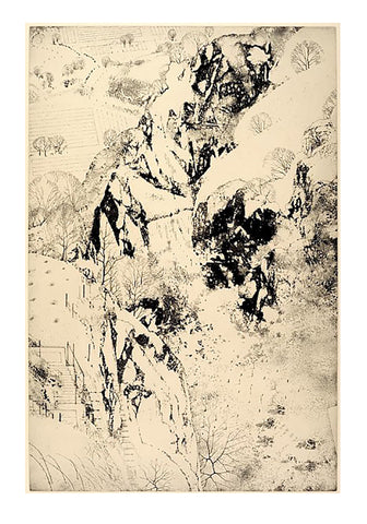
Influenced by his teacher at Yale, Gabor Peterdi, Peter Milton's Sanctuary's Edge has elements of looseness and freedom in depicting this wild landscape of natural rock formations. Milton's own draftsmanship and architectural leanings are shown in the vignettes of suggested staircases and the stylized trees dotting the hillsides. It is as if they have been placed like Easter eggs, to be found and enjoyed. It is in this dichotomy of elements that I think Milton best exhibits his extraordinary talents in creating imaginary worlds.