Wuon Gean Ho, RA Schools - Life Room Venus
Recommended by Nikki (Fine Print Photographer & Content Publisher):
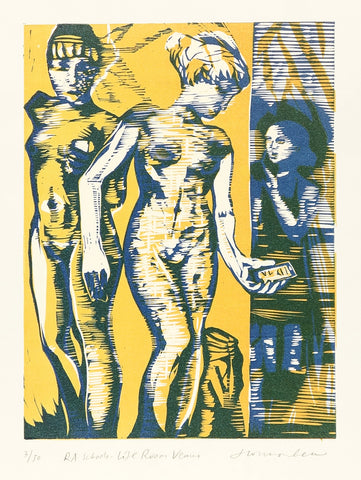
"During her residency at the Royal Academy Schools, Wuon-Gean Ho completed a number of linocut prints in the historic ‘Life Room’, where figure drawing often takes place. In her rendition of Venus, Ho’s playful personality shines through this European traditional space. She brings the statue to life with her rendition of arms, hands, and even a cell phone on the famous woman’s armless body. The linocut print is a reverse image of the actual statue’s left-right orientation. This tells us that Ho most likely carved her linocut block as if it were a life drawing sketch (treating her carving tools like pencils) before printing the resulting image. She even chose to include an alternate view of the statue as well as another artist drawing in the background, much like students would in a figure drawing class. Ho has created a delightfully colorful and humorous take on illustrating a woman’s form with the hallmark textures only linocut relief prints can offer."
Edward Burne-Jones, Beginning of the World
Recommended by Paige (Collections Manager):
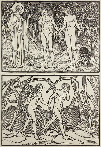
"Beginning of the World was completed after the artist's death from a group of two hundred or so incomplete drawings of the story of Adam and Eve. Although the imagery is fairly traditional, the engraver relying on Chaucer to fill in the blanks, I find the piece unusually contemporary. To me, Eve is uniquely unapologetic and active as she turns to Adam while Adam's shame or disappointment is the most apparent. I appreciate this more modest, emotional, and shameless depiction of Adam, humbly holding his face as he walks hand-in-hand with Eve."
Mary Farrell, Terrain / 4 Directions
Recommended by Catherine (Collections Specialist):
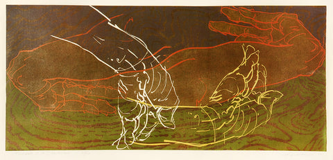
"Terrain / 4 Directions is one of Mary Farrell’s largest and most intricate pieces featuring her iconic portrayal of hands. Reduction woodcut is a notoriously complex technique that requires a great deal of planning. And yet, Farrell conveys a sense of fluid immediacy with the sensitive and sketch-like quality of the forearms and hands. They dance together with strength, grace, and perpetual motion, while the background texture calls to mind both fingerprints and rippling water. Like fish gathered together and circling in a whirlpool, the hands engage in an animated, yet unspoken conversation. I see their vibrant, intertwined outlines as a representation of the vitality and connectedness of all living things."
Peter Milton, Visions and Revisions
Recommended by Suzannah (Marketing and Communications Manager):
“Time for you and time for me,
And time yet for a hundred indecisions,
And for a hundred visions and revisions,
Before the taking of a toast and tea.” - The Love Song of J Alfred Prufrock, by T.S. Eliot
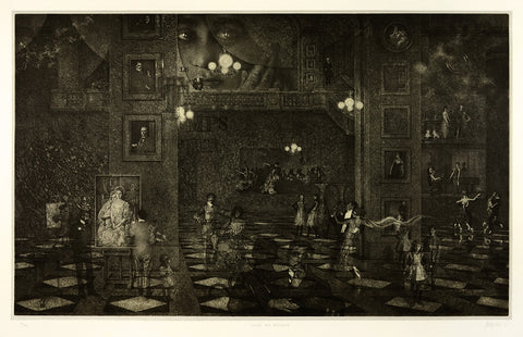
"Peter Milton’s prints share many qualities with the poetry of T.S. Eliot: the grand scale, ghostly vignettes, shifting perspectives, and liminal worlds, as well as a penchant for subtle references to cats in their art. ‘Visions and Revisions’, the title of which is taken from a line in “The Love Song of J Alfred Prufrock”, portrays a party that appears to be in full swing with many figures dancing and socializing. However something in the scene is fractured; the figures are spread far apart, some fading into nothingness, and many staring directly out of the paper at you, the viewer. “The Love Song of J. Alfred Prufrock” tells a story from the perspective of a shy and anxious man who is contemplating attending a party and all the dooms and horrors that will befall him there. I imagine that the viewer is Prufrock, all at once subjected to“the eternal Footman” who holds your hat and coat, among the people “who come and go/talking of Michelangelo,” all while being observed by the woman who is misunderstood and misunderstands you, saying “that is not what I meant at all.” Both the poem and this print convey a powerful sense of disorientation in the midst of frivolity. This print is a haunting and faithful translation of a touchstone modernist poem from verse into visual art."
Eunice Kim, Seedling (9) #1
Recommended by Rebecca (Gallery Manager):

"Eunice Kim’s style and technique has evolved much over the years, but the natural spirit of her work and her commitment to using non toxic materials has only grown. In her new exhibition Currents & Tides, she uses reclaimed wood from a barn on her property to produce stark and natural woodcut prints. In Seedling (9) #1, you can feel the energy and intention that Kim puts into the process of selecting the star pattern from the source print, and painstakingly cutting it out by hand with tiny scissors. Kim melds both natural and human history into a meditative harmony of birth, death, and rebirth."
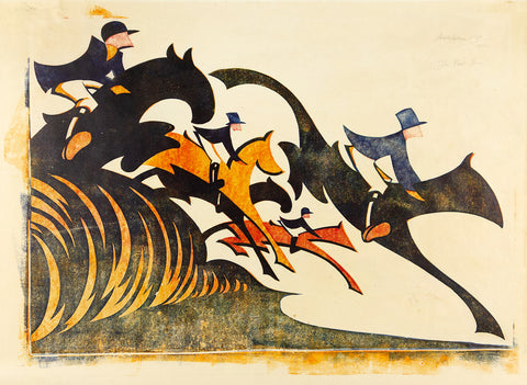
Sybil Andrews, In Full Cry
Recommended by Sam (Gallery Owner & Director):